The famous statistician John Tukey said “The greatest value of a picture is when it forces us to notice what we never expected to see” (Exploratory Data Analysis, 1977). The same is true for many aspects of data science and analysis – the most valuable results are often those that are unexpected or surprising.
Surprising Analytics is Roy Ruddle’s consultancy and training company. With an interdisciplinary background, he has worked with a wide variety of public and private sector organisations (both large and small), delivered many talks and CPD courses and, as a University of Leeds professor, commercialised visualization software for cancer diagnosis, established a petrophysics spin-out company and developed an open data quality method and software.
At Surprising Analytics, I aim to help you to find out what you didn’t know. My work spans the whole data science lifecycle, with these particular specialisms:
- Business understanding
- Data quality
- Visualization
- Explainable AI
- User interface evaluation
Business understanding
I have more than 10 years of experience successfully bridging the gap between data scientists and the end-users and other stakeholders of a given analysis or modelling project.
Surprising Analytics can facilitate the clarity of understanding between your team and clients that speeds up progress and is an essential ingredient of a successful project. For this we use a combination of survey/questionnaire, task analysis, interview and workshop methods.
Data quality
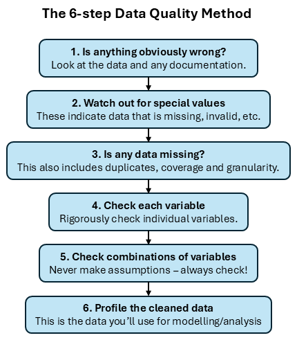
Combining my own practical experience with an extensive literature review and input from data scientists/analysts working in 15+ industry domains, I led the development of the 6-step Data Quality Method. The method enables you to investigate data quality efficiently, rigorously and reproducibly.
Surprising Analytics provides training in the method and bespoke advice about how you should apply it to:
- Save time during data science and analysis projects
- Reduce cost by reducing re-work
- Produce better results by understanding the limitations of your data, correcting mis-held assumptions, and cleaning your data to increase its value.
Visualization
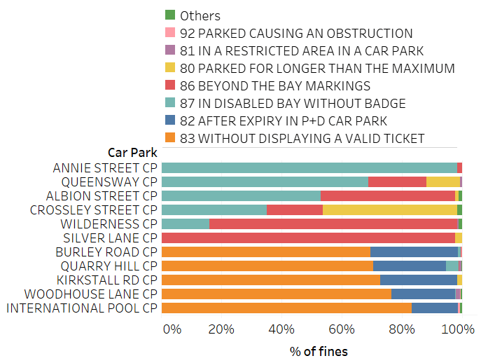
Successful data visualization starts with understanding questions you want to answer about your data, the audience, and the scale, type and other characteristics of the data that is involved. That lets us identify the techniques that would be good choices for each question, and then the visualizations you need. With large or complex data, a set of simple visualizations is almost always better than a single one that tries to show everything.
Surprising Analytics can either design the visualizations you need or design and implement them using a programming API (e.g., Python/Matplotlib) or tool (e.g., Tableau or Excel).
Explainable AI
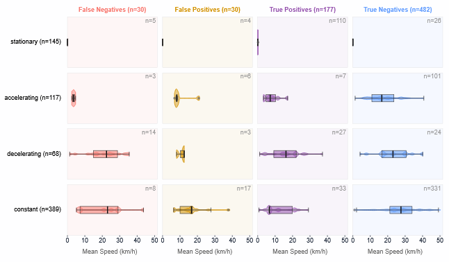
AI modelling methods range from the intrinsically interpretable (e.g., decisions trees) to the opaque (e.g., neural networks).
People expect, and in some cases have a legal right, to be given clear, understandable explanations for the actions and decisions made by AI systems. AI developers use explainability techniques to diagnose, improve and select models. Other stakeholders use explainability evidence as part of AI adoption.
Surprising Analytics breaks explainable AI down into tasks (Feature dependency, etc.) and questions (e.g., “How do a feature’s values vary between classes?”) that depend on the stakeholder and model development stage. Global, local and ablation methods all provide explainability data. We specialise in computational and visual methods that enable you to use that data to provide systematic and rigorous AI explanations.
User interface evaluation
I am also experienced at evaluating user interfaces and apps. I primarily use cognitive walkthrough and heuristic methods, which yield rapid results and both high-level and detailed findings. Typical issues to uncover range from navigation and mental model breakdown to inconsistencies and accessibility.

